Hello lovelies! It’s Saturday and us wedding bloggers often like to veer off the well worn wedded-track at the weekend to write about something a little different. And so today, I’d like to add another piece to my series of ‘being self employed’ posts, and talk a little about my recent blog re-design, and the issue of rebranding. This isn’t a lesson on the importance of rebranding, or having a good brand identity in the first place – there’s plenty of that type of information accessible via Google. I just want to talk a a bit about how I went about rebranding, the various stages and what inspired me etc.
I mooted the idea of writing about how I approached my rebranding and blog redesign and quite a few of my readers expressed an interest, so I do hope that at least some of you find this helpful/interesting. On the other hand, if this is of absolutely no interest to you whatsoever, check back around mid-day for some good stuff of the wedding variety. Oh, and that’s my new blog badge below – please feel free to download a copy and link to Love My Dress via your own blog if you do – thank you!
When I first set out to establish a wedding blog waaaay back in July/August time of 2009, I was certain from the off what colour scheme I wanted. And fonts too. I wanted the whole look to scream ‘vintage’, given this was the type and style of wedding I was naturally drawn to. And thus, I spent several evenings working on what I thought was the perfect ‘tea-stain’ brown.
Hehehe! I laugh now when I think about it, but at the time, I was like a woman possessed. It had to be brown, and the wording simply had to have that very obvious vintage look and feel about it. Thus I chose a very much 1920’s inspired font with a distinct deco feel about it.
As time has progressed and Love My Dress has grown it’s readership and developed an identity, I came to realise that my blog was way more than a space devoted to ‘just’ vintage style weddings, and that infact, I was limiting my brand and blog potential by having a very obvious vintage inspired identity. And so around summertime last year, I set about working out how I could change the colours, layout and imagery associated with Love My Dress, whilst still maintaining the essence of my brand and appeal of my blog. I realised that in order to project the image that Love My Dress was more than just vintage weddings, that I’d have to re-think my colour scheme, my lettering and ultimately my branding and logo.
Four watch words guided me during this process of re-evaluating my style. They were ‘glamorous, gorgeous, elegant and pretty’ – the very essence of what I believe Love My Dress has become.
The first thing to do was to find someone who could help me translate my ideas into something digital and recreate my blog banner.
Working with an Illustrator…
Illusration has been an important part of my brand identity since starting out and I absolutely love the experience of working with an illustrator. I find it hugely rewarding, and the outcome means I have something truly unique to me.
I had a couple of wonderful years working with the incredibly talented Charlotte Thompson-Morley, who created the original ‘Lady Love My Dress’, as I affectionately like to refer to her – my sassy blog alter-ego who always has a pen and notebook close to hand and likes to sit in her office by the window working. Which really is rather like me anyway.
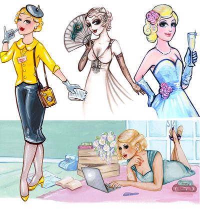
Below are just some of the illustrations that Charlotte has created for me over the past two years. From clockwise top left; the image created for me to advertise for an Intern; the original ‘Lady Love My Dress’ – wearing my actual wedding dress; part of the imagery created to promote the Love My Dress Summer Soiree and one of Charlotte’s final images of Lady Love My Dress in a slightly new guise…
Whilst I was super-lucky to have been able to steal and demand Charlotte’s time pretty much at the drop of a hat since starting out, Charlotte’s circumstances changed last year and as a result, I had less access to her and my time with her was more limited.
It was such a hard decision for me to make but I realised that what I needed was an Illustrator who was able to give me the time I needed and quick-turn around on illustration commissions. And so, with Charlotte’s blessing {thank you lady!} I set about seeking a new Illustrator to work with. I will forever be so incredibly grateful to Charlotte for helping me craft my brand and online identity.
I realised in the very early stages of trying to find a new illustrator, that I was being drawn strongly to the work of Lucy Joy – a lady whose work I was familiar with as her wedding had previously featured on Love My Dress. Lucy is an incredibly talented illustrator and as her name might suggest, she really is an absolute joy to work with.
I dropped Lucy a note, explained my needs and wish to rebrand and in no time at all, she was mocking up sample looks for me. She totally got that I needed and wanted to freshen up the overall feel of Love My Dress and work with a new palette of colours and slightly different styling.
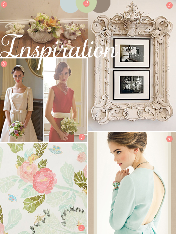
What I love most about working with Lucy is her ability to so easily pick up and translate my ideas; sitting below is something a little bit like what I fed through to Lucy…
1. A beautiful swan vase via The Flower Appreciation Society 2. Farrow and Ball paint colours {from left to right, Parma Grey, Cooking Apple Green and Charleston gray} 3. An ornate frame mirror, via Pinterest 4. An image of a model via the From Me To You blog 5. Watercolour peony wallpaper via Anthropologie 6 and 7. Vintage inspired dressses by Zoe Lem
Colour wise, I was glued to the Farrow and Ball paint colours page. I have always been drawn to green, but a post on the Florence Finds website by Photographer Laura Lawson opened my eyes to the gorgeousness that is ‘cooking apple green‘, which really set the backdrop for my new look blog and became the basis for the new colour palette.
I was dead keen on having an ornate style frame to my banner, and to maintaining a similar ‘scene’ in the banner, that wasn’t ‘too weddingy” but more suggestive of a writer sat in her study, reading her magazines or penning her latest thoughts. Lucy found it hilarious that I asked her for a ‘kitsch swan’, after I was so inspired by the wonderful Flower Appreciation Society {I’m completely hooked on their blog!}. I also wanted to be able to incorporate more texture into the banner, and Lucy did a beautiful job of creating a floral wallpaper.
The pretty dresses to the left were inspired via this photoshoot of Zoe Lem’s vintage inspired wedding dreses, which I adore.
Funnily enough, that image in 4 above there was discovered after I had chosen the colour of the dress for Lady Love My Dress, but it represents pefectly the elegance and colour scheme I was trying to achieve in rebranding, and I shared it with Lucy as we were pulling the new look together.
By the way, I run a Typepad blog and coding the new banner design was rather faffy and quite expensive, though, I gather, much less expensive than the going rate it apparently costs folk to pay a developer to redesign/code their WordPress blogs. People often ask me why I don’t move to WordPress, and I have considered it several times, but on the whole, Typepad provide an amazing and very responsive customer service – a service WordPress does not provide. So I’ve decided to stick around here for the time being {incase you are interested, other well established Typepad blogs include Style Bubble, Oh Joy! and A Beautiful Mess}.
So you see, there was so much to be inspired by. It was simply a case of identifying colours and a style that I think will take Love My Dress forward and onto the next level – providing a more honest representation of the essence, and content of Love My Dress. I think I’ve got it right. I hope this works. I’ve had such a positive response to my rebrand, despite there still being a couple of little glitches viewing my beautiful new blog design via the ipad {I’m working on it!} everything else seems to have gone perfectly to plan and I’m just so delighted with it all. I’m feeling really confident so, fingers crossed.
Fonts and Lettering…
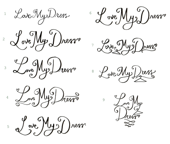
It was really, really important to me that I didn’t use a pre-paid font on my new banner. I wanted the lettering to look pretty, and fresh, as though I had just written it – but with a little hint of cheekiness. Yes. Exactly that. And that is precisly what I asked Lucy for.
Here is what Lucy sent through as first drafts. I absolutely loved this, but for me, the letters were to detailed and fancy – I wanted to keep the lettering quite simple so not to detract from the detailed banner design…
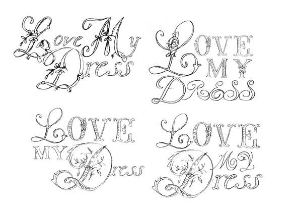
….and here is what Lucy sent me as a result, which was far more in keeping with what I had in mind.
In the end, I went with a combination of 1 and 3 and the colour was adapted to fit in with the rest of the re-design…
Change is good…
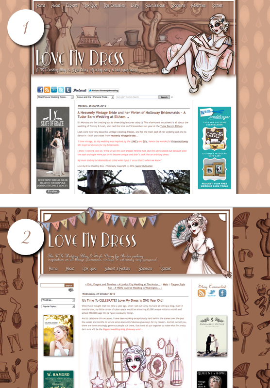
This is what my blog looked like before things were freshened up {see ‘1’} and the image below it was the design that pre-dated that {see ‘2’}.
As you will see, I had already tried to start to ‘lighten’ the brown. It just wasn’t working for me anymore. When I look at the images below, they seem somewhat aged and the general feel doesn’t inspire me anymore. And if I’m not feeling inspired, how can I expect my readers to be? To me, a blog isn’t just a digital page, it’s more like a virtual room, a space you can go to and get comfy in for a while, as you sit and read your favourite magazine. I want my room to be pretty and relaxing, with a sense of contemporary charm mixed with vintage inspired elegance…
Brand Products & Protecting my brand…
So the next stage is to get me some branded products together and this is something I’ll be getting on to next week. To begin with, they will include some cute little magnets, some beautiful letter-press postcards/book marks and of course, my business cards – little treats for my readers and to hand out at industry events. I have more products planned too, but you’re going to have to wait a little while yet to hear about them.
And of course, the most important step of all of this is to trademark protect my brand name and image and with that in mind, I’ll be filing for trademark protection next week once my new logo is ready.
This is something I’ve been parking for some time now but I wouldn’t encourage you do the same! If yo have a brand you are trying to develop, I very strongly encourage you to research into registering your business name and any associated logo with.
Things I’ve learned from re-branding…
- Here is a quick list of thing I have learned from this experience of rebranding:-
- If you would like to work with an illustrator, do your homework/research to find the right one. Ask your peers/colleagues for recommendations. Or ask for referrals on Twitter etc.
- Once you have found your ideal illustrator, ascertain their fees. Do they have hourly rates or package rates? Ask how quickly they can turn around your commissions. Ask if they are contactable during the weekend {they shouldn’t have to be but I have found it immensely useful that Lucy occasionally is for instance}.
- Be inspired. Gather images that inspire you to share with your illustrator or brand designer – think colours, shapes, textures – even smells and sounds can inspire a new brand design. Dump a load of ideas into an email even if it is garbled as it comes out of your head. Your inner thoughts will give your designer/Illustrator a wonderful insight into your personal vision.
- A great way of sharing your visual inspiration and imagery with your brand designer is via Pinterest, or, if you want to keep things truly private until the branding is complete, you can share via Dropbox. And remember inspiration is all around, not just online or to be found via your computer.
- Don’t be afraid to go back to the illustrator and ask them to tweak/redraft even redesign until you are completely and utterly satisfied with the outcome.
- Don’t be afraid to be honest. Be you. In my case my brand really does represent me. I want to truly believe in the imagery I am putting out there to represent my blog. This meant I had to be honest and truthful about my preferences and ideas. Open up. Dig deep. Spill your ideas onto paper or write them out with a pen but be truthful to yourself and who you are, especially if like me, you are managing an independent blog that really is an extension of your personality.
- If you need colour inspiration, the Farrow & Ball colours page is amazing.
So there we have it folks, Saturday morning post on rebranding. I love to read how other people have done this kind of thing and so I hope it’s helped inspire those of you perhaps in the early stages of business and considering brand image, or anyone who might be considering rebranding themselves.
I’d love some feedback on this post if you are so inclined!
Have you rebranded lately or are you thinking about rebranding?
Or maybe you are in the stages of establishing a brand and logo for the very first time – what has your experience been like so far?
Have you trademark protected your brand yet?
And *gulp*… what do you think of the new Love My Dress rebrand?
Much love as always folks and as promised, be back here around noon for some wedding goodness.
Much love,
Annabel x
You can follow Love My Dress on Facebook, Pinterest, Instagram, Twitter, Linked-In, Google Plus, Google Reader, RSS Feed and subscribe to the Love My Dress Newsletter.




Good morning Annabel, such a fantastic and helpful start to the weekend, thank you! An insight into working with an illustrator and a timely mention of trademarking too as it is something I am currently looking into. The LMD re-brand is such a great reflection of not only you, but of the growth and development of the blog – ’tis beautiful! Jenna xx
This is so interesting! As an avid reader of your blog, bride to be and small business owner, this is such a fascinating read. Thank you Annabel!
Thank you Annabel for such an interesting read. My husband is in the process of branding our business and although he is an illustrator and designer this has been a long process (and will continue to be!) We both have very distinct styles and trying to brand our identity together has resulted in some conflict of ideas! I am often amazed by the lack of thought and time that some businesses take when branding, and it does show; it is such a huge aspect of the package and one that requires constant tweaking.
It is so refreshing to see an illustrated blog and the LMD rebrand clearly represents all that you believe in and all that you hope to achieve in the future. Exciting times! xx
I absolutely love your new branding Annabel! It’s new, fresh and modern yet absolutely stays true to your brand, capturing that vintage elegance that we all know and love LMD for! xo
Thanks for sharing Annabel. We have a few things in the pipeline at the moment and your insight has been very useful.
Fantastic post again. I have to say I just love your new look and it’s so refreshing to hear that your brand isn’t just vintage it’s so much more than that. I have always looked at your blog and seen the beautiful illustrations, niche….. lovely and so LMD. Congratulations!
Great post and wished you wrote this two years ago when I went through a huge rebrand myself. Buying fonts , searching for hours on end for the right logo designer. It’s all paid off and its lovely when someone that knows you well, thinks your brand identity is so you.
Excited to see where this rebrand takes you xxxx
Thanks so much Victoria! Really appreciate your feedback.
Will have to go and take a peek at your site now of course! 🙂
Thanks for your kind words xXx
Love the redesign. Easy to read fonts in a simple and elegant layout. Top work!
Great post, as I am in the process of rebranding from http://www.weddingandbaby.co.uk to http://www.lhgdesigns.co.uk
Keeping my colour scheme like yourself and my basic logo – but the name change was a big step for me and not fully implimented yet.
Lovely post Annabel and lovely fresh new look; we here at HOI do like your weekend posts xx
You’re always an inspiration. Love xo
Great insight into your rebrand. I’m having a think about what I can do with mine. I’m going on a Branding Masterclass course which I hope proves interesting. You learn about colour psychology. I think we are very similar. Cooking Apple Green has followed me in all our houses. I will download your lovely new badge to my website. xx
What an insightful read… I am very lucky in that my website is WordPress and was co designed (as well as myself) and made by my very clever Fiance, I don’t think I could have done it myself ( I don’t have your patience Annabel!) It’s very interesting to see what programs people relate to, I up date my website quite often compared to a lot of other make up artists and it was very important I be able to do it myself. Word press was the only template I found I could use.
I have re branded myself quite a few times as well, I think I am getting there… for me it’s about having a clean slate for my clients to appreciate my make up work and imagine it on themselves. It’s lovely to see someone take the time and thought into their branding these days, some people just use a generic template and think that’s it. But then that’s why we all love your blog. Your work pays off. It’s beautiful x
I’m a freelance writer and I actually write a lot about illustration and branding so I found this really interesting. I love the new look, it’s fantastic – you and Lucy should be very chuffed!
Thanks so much for sharing this! I am currently working on the branding for an antique jewellery business I am starting and it’s so insightful to read how you worked with an illustrator for your designs, and particularly, how you approached choosing your font for the logo. The new look is great – thanks for writing about your design process in so much detail!
Thanks Jonny, you’re so welcome. I love to share this kind of thing as I love to learn from others too!
Oh that’s so encouraging Anne, thank you xx
Kylie thank you so much for your kind words. Hugely appreciated. Of course some of your very own prettiness will be gracing these pages very soon. Can’t wait 🙂
THANK you Lou. Still some compatability issues to iron out {grr!} but nearly there 🙂 The new colours really work for me, they reall make the browsing experience much more enjoyable! 😉
Huge tanks Graham!
Thank you lovely lady 🙂
Thankyou my cooking apple green friend. I knew you’d love it 🙂 xXx
You are too sweet! Thanks! Just trying to be helpful 🙂
Thank you Hannah for the reply.
Branding is so important, it’s everything that represents your professional images, it’s not easy to get it right.
Such encouraging comments in your last paragraph, thanks a million for that, much appreciated xXx
Pleasure Trina!
Thanks Rachel! Do you have a blog too for your business?
Oh Jenna, thank you so much 🙂