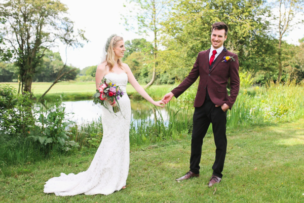
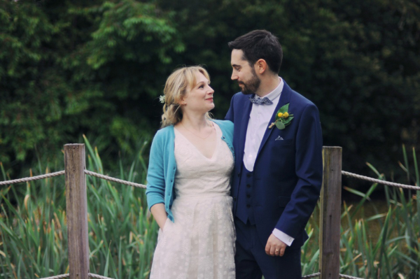
What are your wedding colours? I’m sure if you are in the midst of planning your day you will have been asked this question at least once.
No doubt swiftly followed by an eye roll on your part. Gone are the days when everything has to be pantone matched to a certain shade, instead modern-minded couples are taking a slightly more daring and design-focused approach, choosing colours that will enhance the vibe of their day whilst being truly reflective of who they are.
But with literally thousands of colour palette combos at your disposal how do you begin to narrow down what’s right for you? Well as a starting point you need to think about your colour palette in the context of a number of other elements:
Mood
Colours have an amazing ability to evoke strong psychological responses affecting both moods and emotions. So you may want to think about what you are communicating through your colour palette and the kind of mood or vibe you wish to create for your day. A strong red for example is typically associated with drama, excitement and passion so could be the perfect colour for a sultry and high-end glamour look or for more of a lively and energetic day then yellow would work for you.
Think back to the type of day you’re trying to create and consider whether the colours you are looking at fit naturally with your vision.


Location
This will be one of your main driving factors and the key is to make sure that you select a palette that complements or enhances your venue. This will avoid too many colours fighting for attention and often means you can invest less in décor by making the most of what is already there. So think about the colours that exist within your venue; are the walls, carpets and décor in neutral shades or are they bright, vibrant colours?
Is there a colourful feature at the venue that can be the starting point for your palette, e.g. a painted door or piece of furniture.
Season
It’s often best to work in harmony with the season as the changing landscape around you will naturally become part of your colour palette. Think about the warm and earthy tones found in autumn and the sunny fresh shades in spring that you can either complement or contrast with. Which leads me nicely onto the next element.
Colour Theory
This is something that as designers is just ingrained into the way we work, we certainly don’t get the colour wheel out every time we start a new design concept but we do draw upon the principles to create harmonious and exciting colour schemes.


Complimentary
These are the ones found opposite each other on the colour wheel and are highly contrasting colours, it’s often better if one of these strong shades is the dominant colour with the other used as an accent.
Analogous
Colours that can be found next to each other on the wheel, these are very harmonious colours and typically a little more natural feeling. These will offer a more serene and subtle design.
Triadic
Think about placing a triangle over the wheel and picking out the three colours at each point. This mixture gives strong visual contrast whilst still feeling balanced, it’s usually the case that one colour will be dominant rather than used in equal measure.
Split complementar
Similar to complementary but using the adjacent colours to the complementary shade. Again this gives a little more harmony and isn’t as harshly contrasting.
Tetradic
This is where things start to get harder as there’s a lot of colours to play with, some cool, some warm so it needs to be very carefully designed to get the balance right
Square
Similar to above, schemes that use a lot of colours can be vibrant but also jarring if not executed well.
So that’s the basic theory principles but how does this all work in practice? Well I thought I would show you a few palette examples, drawing upon Pantone’s Spring colours. Every year Pantone produce their guide to seasonal shades that will influence design, so everything from graphic and web design through to homewares and fashion.
This year they say the palette is influenced by nature, feels calm and will transport us to a happy place – the perfect starting point for any celebration then. And it is a rather lovely collection of colours….

In this first example I’ve used Peach Echo which is a lovely warm colour that feels friendly and playful, mixing it with the soft and subtle Iced Coffee – the latter one is pretty much a neutral so will work harmoniously with any of the other shades in the palette and can be seen in elements like the raw natural woods, the pie crust and the kraft-coloured writing on the stationery.
 Image credits: one / two / three / four
Next is Snorkel Blue and Iced Coffee, again a relatively harmonious, easy-on-the-eye palette with the strong, almost nautical feeling, blue taking the lead whilst the natural wood and brass elements softly support it and keep it from being too overpowering.
 Image credits: one / two / three / four
Here we have an example of complementary colours working together, so Peach Echo and Lilac Grey can be found at opposite ends of the colour wheel. As they are softer, more pared back hues instead of vibrant shades they are not too overpowering or child-like instead offering a subtle playfulness.
 Image credits: one / two / three / four
The Rose Quartz and Lilac Grey combination below is much more analogous in composition, with the colours almost directly next to each other on the colour wheel, so again it feels harmonious and quite effortlessly stylish.

Image credits: one / two / three / four
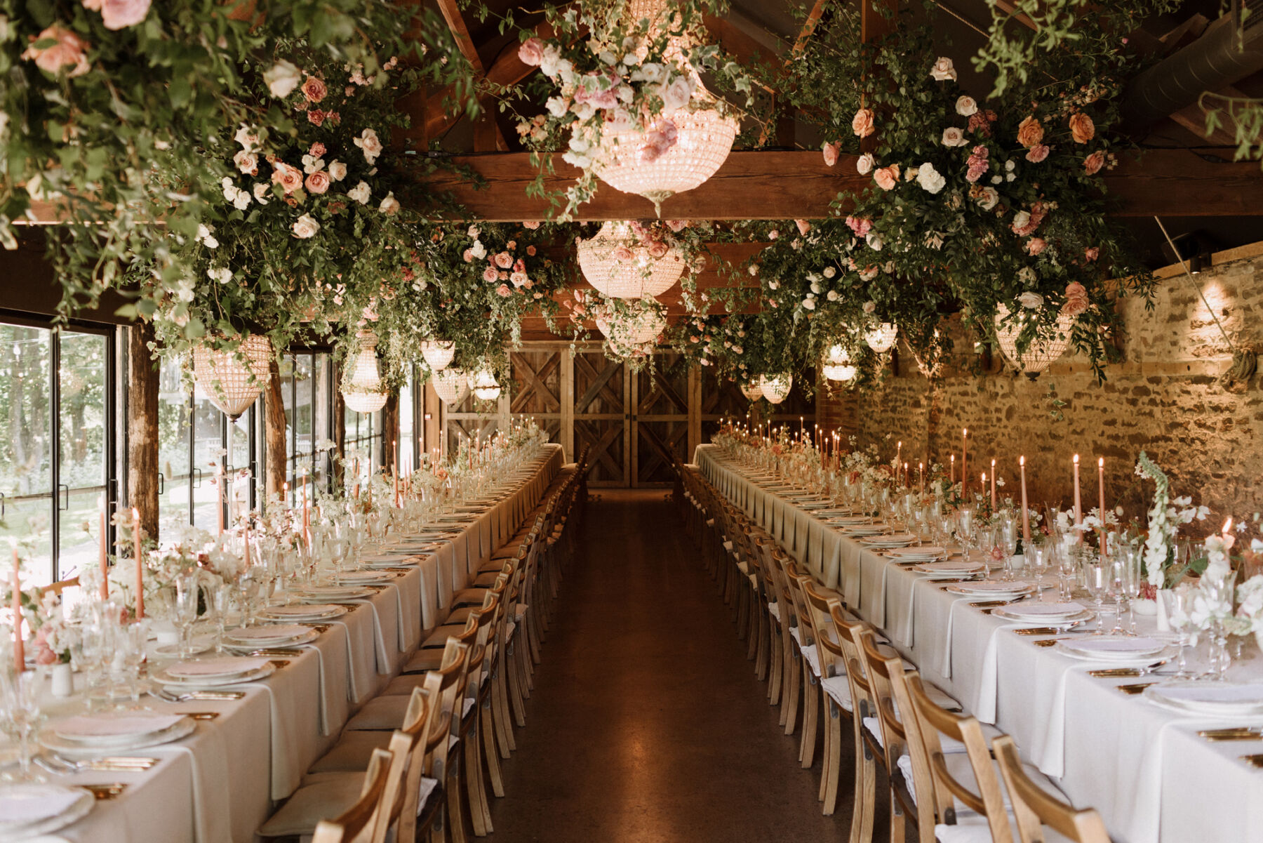
Now we’ve moved onto a more challenging palette, combining multiple shades and principles. The fusion of Peach Echo, Snorkel Blue and Serenity works well and feels fun and fresh, you have the analogous shades of blue working with the complementary peach, but notice how the peach is used sparingly and in clusters in this stunning ceremony arbor – if it was dotted all around that could feel quite chaotic with so much else going on. This is where your creative designers (e.g. your florist, stationer, wedding planner etc) should guide you about how to make your colour-choices feel unified.

Image credits: one / two / three / four
Finally we have a mix of two analogous and two complementaries with Fiesta, Peach Echo, Limpet Shell and Snorkel Blue. As you can see this offers a really vibrant and powerful mix of colours, it feels fun and eclectic and is definitely more suited to a laidback boho-vibe day than anything overly formal.

Image credits: one / two / three / four
So as you can see there are so many options for developing your own wedding colour palette but if you follow a few key principles: consider your venue first, choose colours that will evoke emotions and therefore create the vibe you are after and then layer on seasonality then you can’t go wrong.
Here’s a few ideas about how to infuse your chosen colours into your day:
- Florals are an obvious choice but if you have a lot of other colourful elements fighting for attention then you might want to consider more neutral florals with the odd pop of colour for a more stylish look
- On-the-day stationery is fantastic for infusing a bulk of colour and it means you can go ga-ga over colourplan paper samples – alternatively, having just a splash of colour on an otherwise neutral piece of stationery can be just as lovely and seek out different stamps that work with your scheme over the standard ones
- Your tableware plays a big part in the overall design so think about coloured linens, napkins, glassware even crockery. Whilst coloured candles can look really lovely.
- To continue the flow of the design think about how your lighting can complement once the party kicks off – you can use bespoke colour-washes across an entire room rather than standard disco lights
- Your food and drink is definitely a great opportunity to add in subtle colour touches, from fruit garnishes to colourful cocktails. Just avoid colouring foods in odd colours, only smurfs like to drink blue cocktails.
- If you have a dry-hire venue then consider how different coloured furniture can add to the design, even the odd brightly coloured chair dotted into a scheme can elevate it. Companies like Vintage Style Hire even offer a bespoke painting service if you cannot find the exact piece you want.
- And don’t forget the little details either: co-ordinate your confetti, place matching soaps in the guest bathrooms, provide gorgeous getting ready gowns for your maids, even add a dash of colour to your own make-up and jewellery.
If you’re finding colour palettes and design decisions are getting you in a tailspin then call upon the experts. We offer a design service to couples looking for beautiful and one-of-a-kind events, blending our expert design skills with your own vision, to create truly unique celebrations.
Michelle x
____________________________
We love to share features by Michelle Kelly, Creative Director and expert wedding planner at Pocketful of Dreams – and partner/collaborator with Love My Dress. Pocketful of Dreams create captivating and unforgettable celebrations for creative clients across the UK and Europe and provide everything from on-the-day assistance only, to full wedding planning and styling. If you think you’d like to chat with Michelle about your own wedding, you can drop her a line on [email protected] or visit pocketfulofdreams.co.uk for more information.