It’s an immense pleasure to be sharing these images with you today, supplied by florist Jay of Jay Archer Floral Design, who worked with photographer Rebecca Goddard. These images. Beautiful images like these need little introduction, but just to add some context, they came about through Jay’s recent rebranding. I really hope that these gorgeous images inspire those of your looking for some exquisite wedding flowers and floral design inspiration. Over to you Jay…
“My love for texture and sourcing unusual ingredients has always been a big influence on my work and more than ever in recent times, has seen me focus on sourcing as many British and locally grown flowers as I can. I have been in business for coming up to six years, and have always been a fan of British, but it’s that feeling you get when going to a field to pick or smell a flowers scent you didn’t even know had fragrance that I constantly crave and helps me push myself to find new varieties.”
Photography by Rebecca Goddard
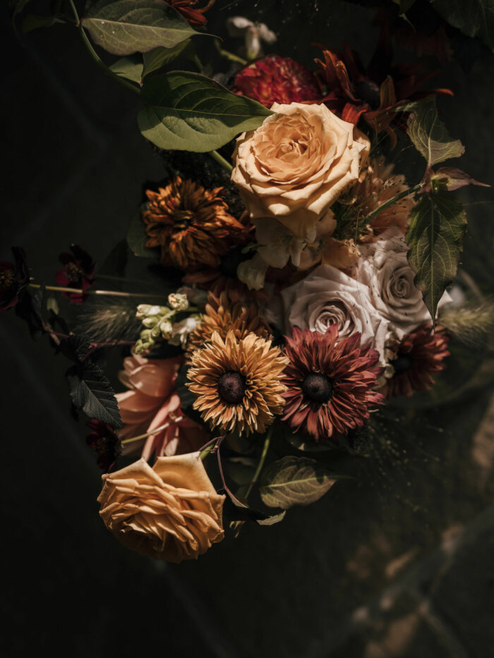
“I have always been a fan of colour too- sounds obvious, but I mean all colour. Whites and neutrals come alive with naturally golden, dried seed heads and grasses whilst a pop of orange against a deep, broody purple is quite magical.”
“Allowing myself time to revisit all the things, and really give myself time to work on and push these areas again has produced a shoot which I am so proud of, and feel is so Jay Archer Floral Design.”
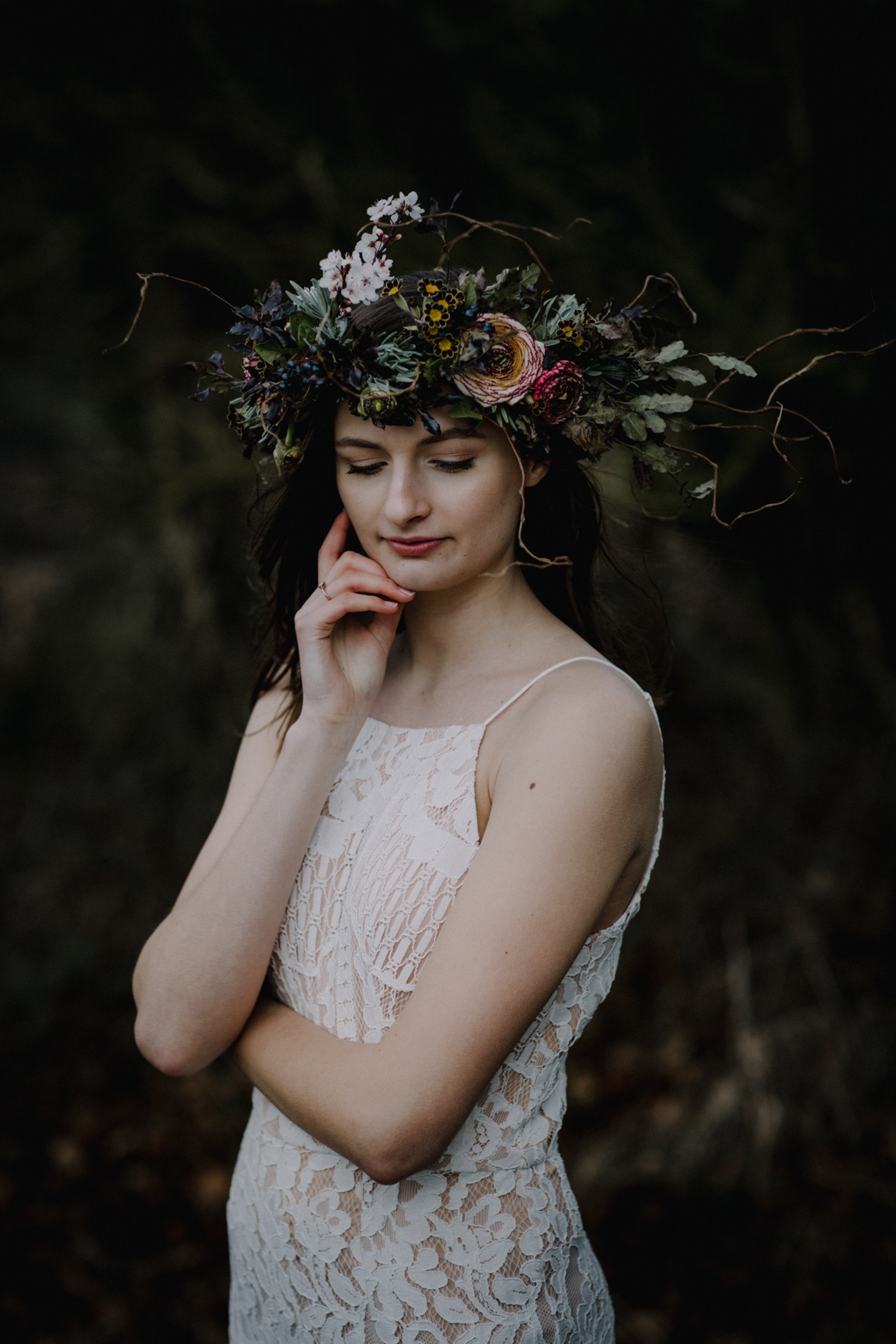
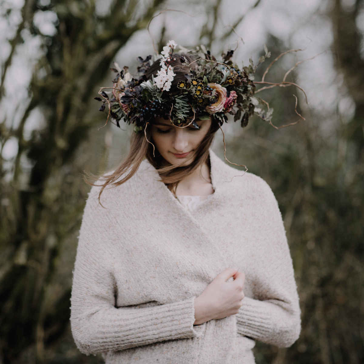
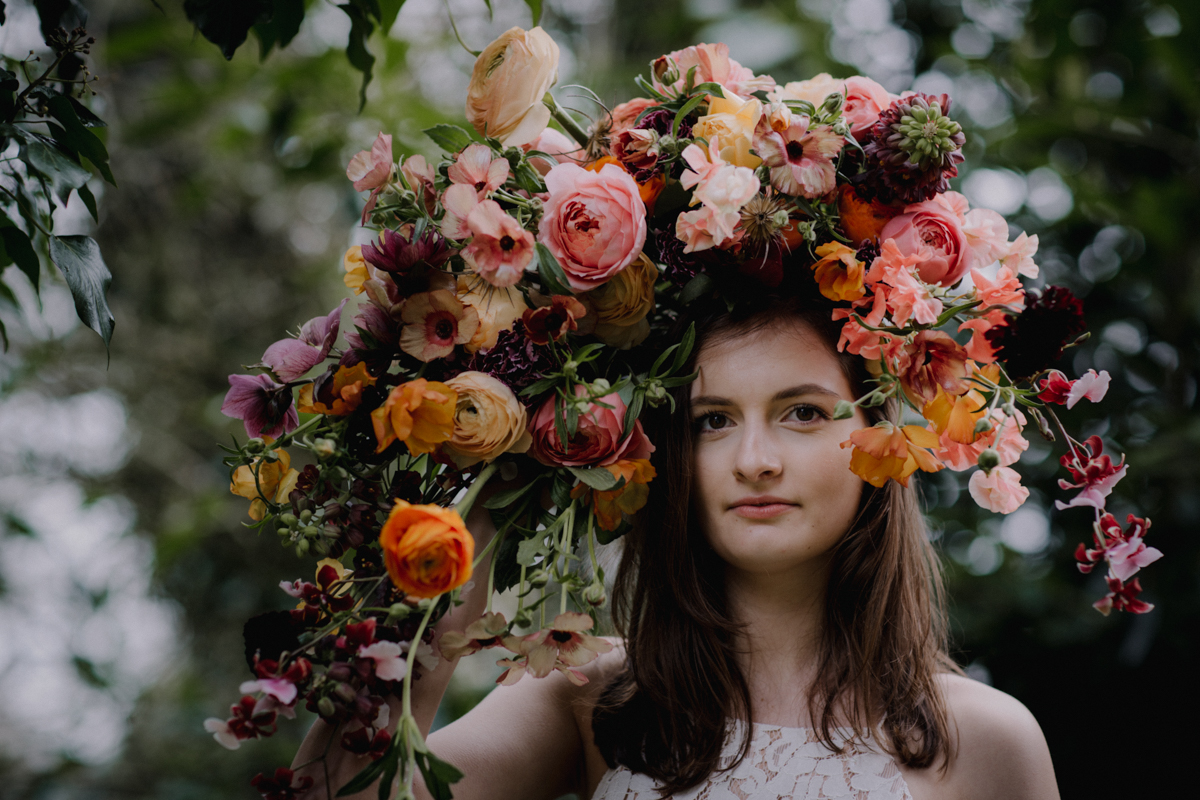
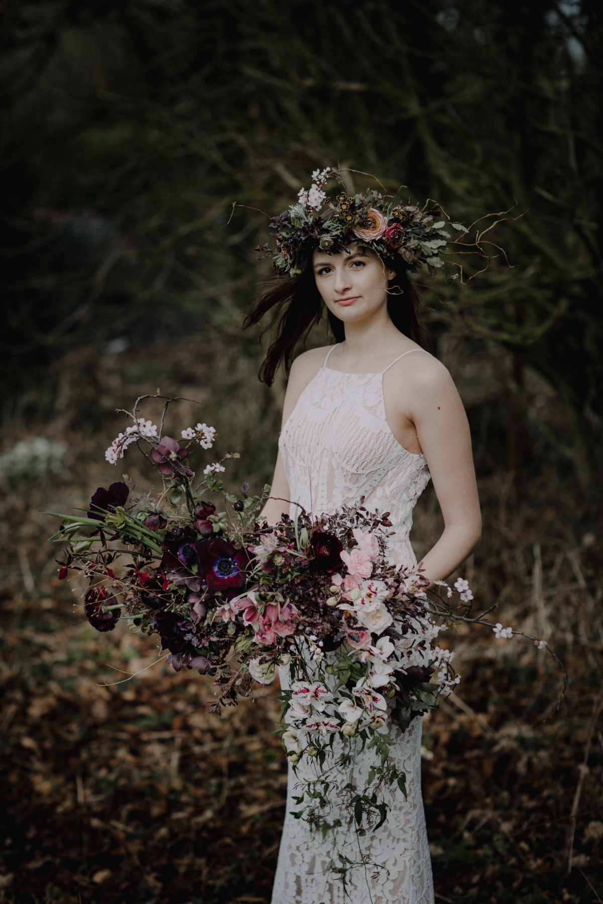
“When I got the images back, it made me realise that although different the colour palettes used are still very bridal. For example, on the models dark hair, the dark foliage and flowers of the hair circlet looks amazing on our model, and almost blends in. For the circlet I used pittosporum, primroses, cappuccino ranunculus, blossom, willow, viburnum berries and lavender. I used heirloom silk ribbon on this too, in olive, although it’s not seen. The touch of blush blossom lifts the circlet and the little yellow faces of the primrose is notably spring.”
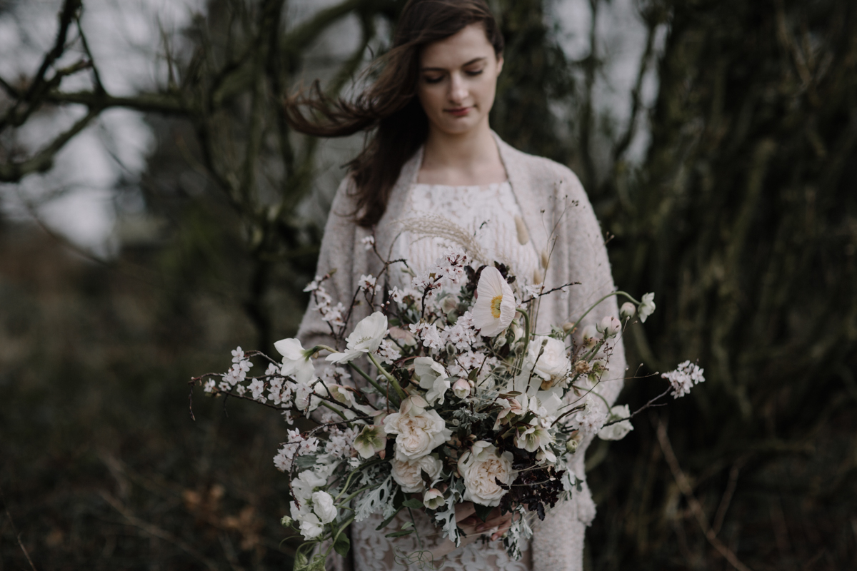
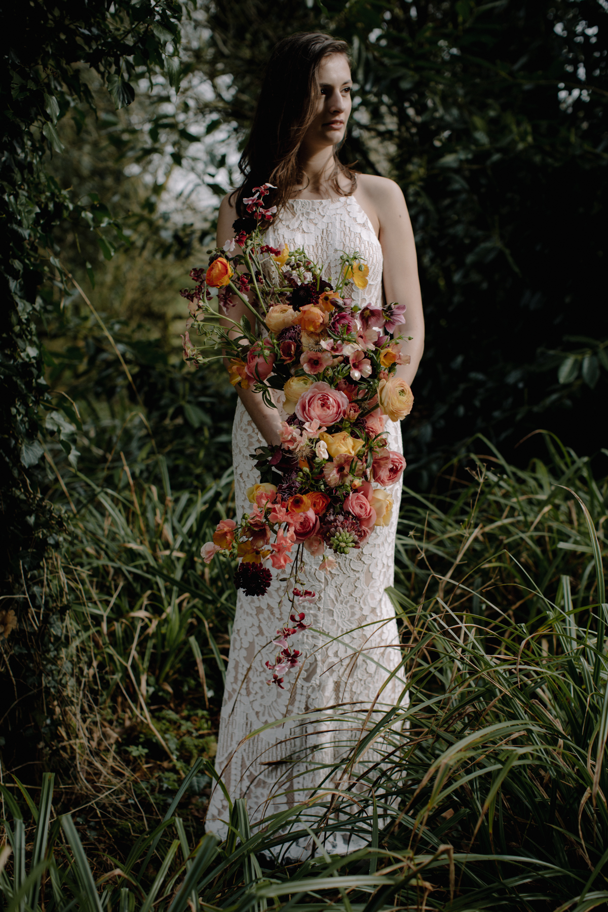
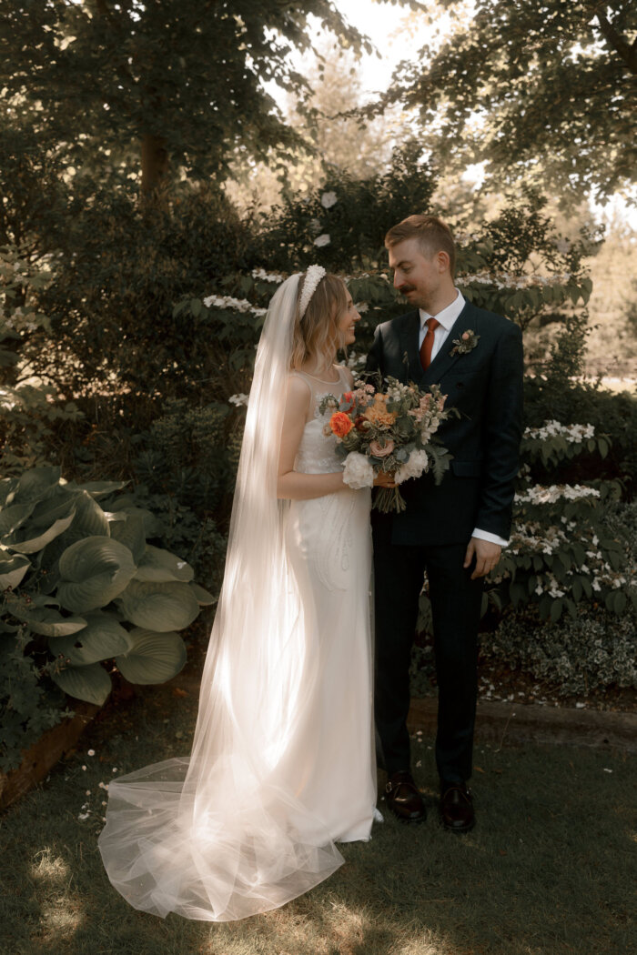
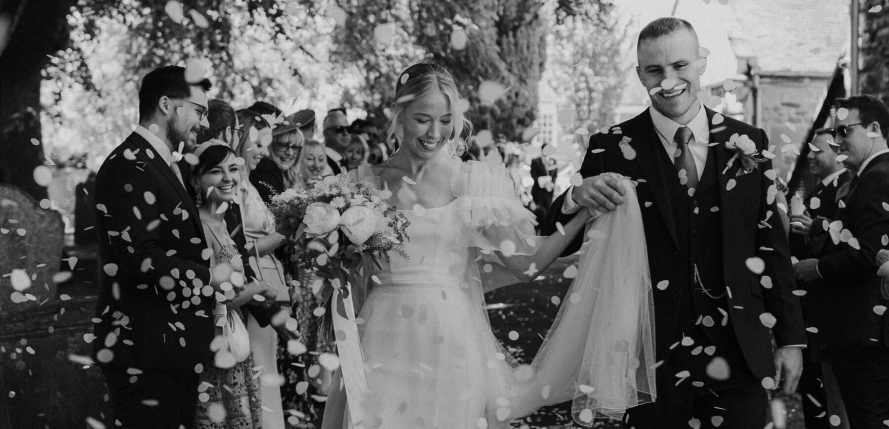
“Teaming the circlet with the neutral textures gathered bouquet, works against the pale dress (ASOS) and softens the look. The bouquet is made up of David Austin roses, with dried foraged grasses, English poppies, ranunculus, senecio, blossom, hellebores and other seasonal treasures.”
“Senecio is a popular bridal foliage, as it can be softer than bold greens against the delicacies of a blush or white palette… asking florists for glaucous foliage, instead of eucalyptus, means you get something more appeasing to the English garden flowers too.”
“‘Silver’ foliages such as hebe, rosemary, sorbus, lavender, silver pear and Convolvulus cneorum (silver bush) are all good choices. However, what I really enjoy about this bouquet is the dark foliage again- it makes the flowers pop and really stands out against the dress. A lot of brides want white roses in their bouquets, but they’re rarely a true white and often look very yellow against the dress. Using dark and silver foliage neutralises this, instead of greens which can enhance the yellow undertones.”
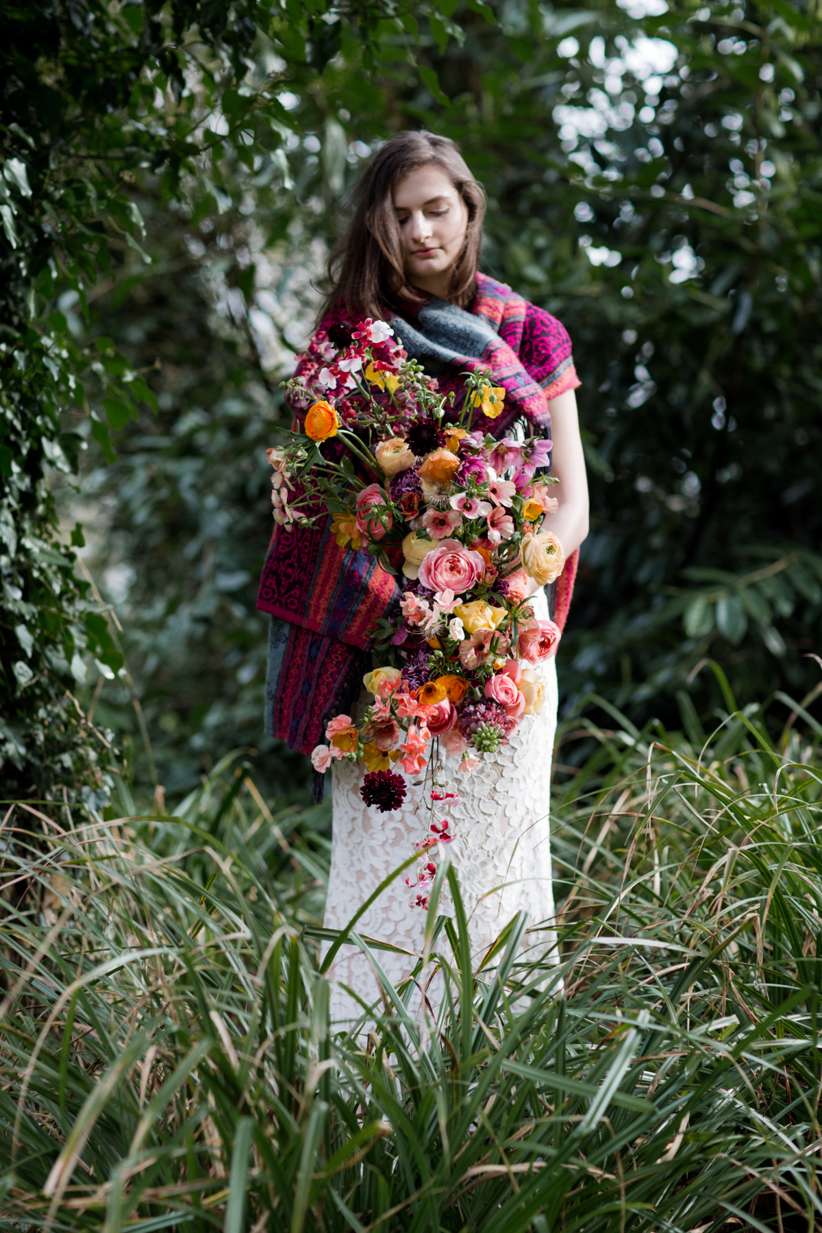
“On the subject of bridal bouquets, a lot of Jay Archer Floral Design clients want a loose, garden gathered bouquet or a wide, free-form asymmetric style. I love creating both, and the possibilities of shape are endless and can change dramatically depending on ingredients- from the rich, luxe look of head heavy peonies, ranunculus and roses, to soft, wispy and whimsy with trailing vines and delicate grasses.”
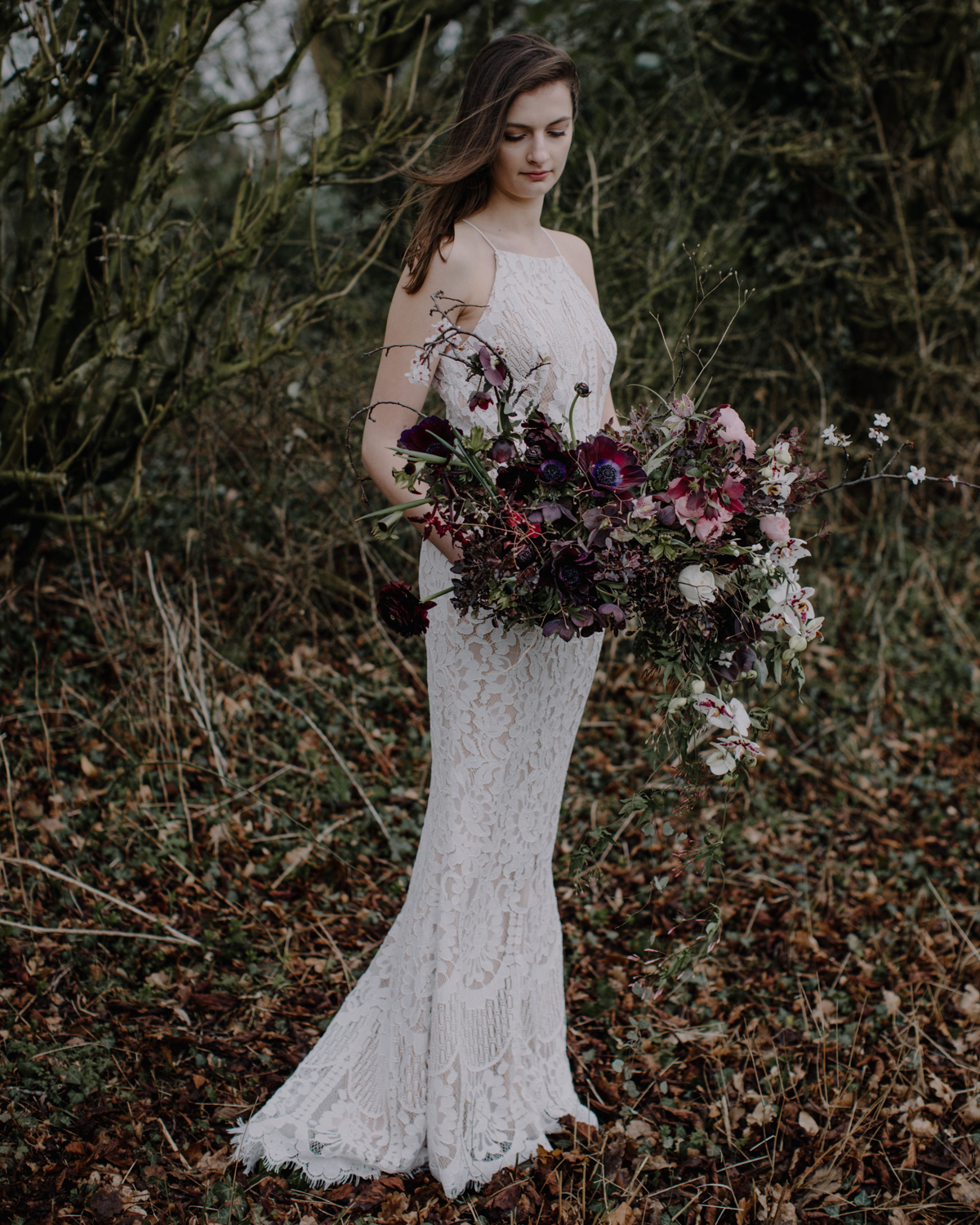
“However, I thought I’d try something different and have designed this crescent shape- it’s fun, playful and, well, a bit daring. Granted not everyone will go for it I am sure but I’ve already had 2 clients contact me to change their bouquet style after seeing it on Instagram… and you’ll see the shot works for a flower crown (in the literal sense!) too!”
“Your wedding flowers are about having fun, showing your personality and adding romance- don’t over think them and trust your own taste!”
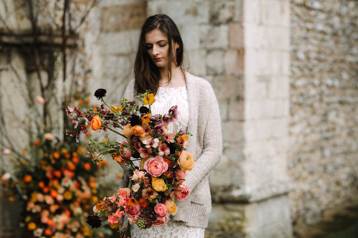
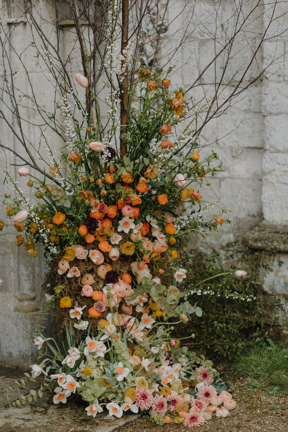
“Sticking with the theme of colour, I wanted to create something really contrasting and bold, using colours not soften paired together. In Spring, we often see pastels with a focus on whites, pale pinks and blues… but there are so many more beautifully brighter coloured flowers around! Everything I have used in typically Spring- ranunculus, lilac, daffodils, frittilary, daffodils, narcissi, spirea, tulips and iris- but in bold, daring shades.
We created an ombre effect, and used lots of transitional colours to make the piece work as a whole- peach tones, soft creams, lilac, lavenders and both mid and glacous greens. The arch at the top of the church is no beautiful anyway, and it would have been a shame to cover it, so we filled out the base with shrubs to make the whole piece seem more established; a birch tree and added falling swatches of blooms, seemingly running off the design and on to the ground.”
“The small vases of flowers are all about simplicity, and adding unusual textures together. Not normally a fan of anything remotely tropical, I really enjoyed the clean, simple lines of these orchids against the soft, Englishness of the narcissi, the muscari and the carnations… a flower which is often overlooked as old-fashioned! I’d love to see clients using more yellow- from the palest buttermilk to the brightest, deepest ochre. These little pots would work amazing gathered and clustered together down a top table, or on a mantle.”
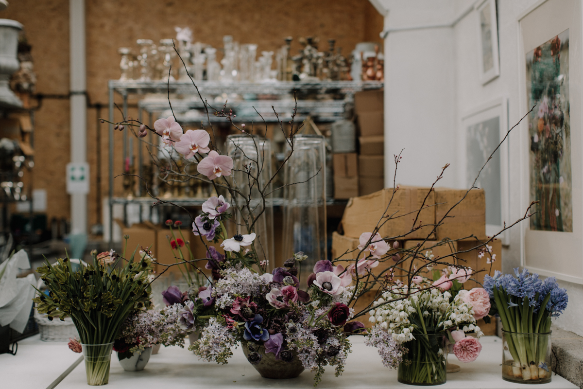
“Purple can work amazingly well with so many other colours, and suits most venues be it wooden panelled country manor or plain white marquee. Using seasonal lilac, blossom and those incredible anemones, I created this piece by really studying the lines and forms of the stems, and the heads. I am trying to be more mindful with flowers at the moment, and am enjoying the creative process a lot more- something which again, reflects in the body of this work.”
“Fundamentally, what I am trying to encourage is that wedding couples are more daring with there colour and texture choices- people often have to ‘see it to get it’, but it can be a limiting approach. Talk to your florist, find out what is in season, what colours are available and be brave! Even just touches of orange to a blush and white scheme can add dynamic, interest and personality… what have you got to lose?”
Huge love and thanks to both Jay Archer and photographer Rebecca Goddard for sharing these sublime images today. I truly hope they have inspired some of you.
Love Annabel x
Credits & Thanks
- Photography - Rebecca Goddard
- Floral Styling - Jay Archer Floral Design


Thank you so so much Annabel and team for featuring me. Xx
You are welcome Jay xxx